First, there is all the recent talk about relaxing shutdown orders. Anyone can see from the data that this is still premature. Very few states have any signs of a decline in the rate of new cases, while even the Trump framework calls for at least 14 days of decline. My scan of the data shows that NY and LA are the only states with any arguable decline (apart from the more sparsely populated ones with too much statistical noise to say definitively, like VT, ID, MT, WY, AK). The NY data could be consistent with up to a week of declining cases, but this is relatively moot since NY can't really relax its shutdown until they see declines in NJ, CT, and other neighboring states (and CT is still growing at a doubling time of some 22 days currently). The LA data are harder to interpret, with something of a peak around the beginning of Apr. However, that peak could also be fluctuations and the data could well be consistent with a flat rate for the past week. Earlier on, WA was looking consistent with a decline, but the case rate went up on Apr 17 and has stayed flat there since then. Similarly, MI was showing some hints of decline, but today's point has gone back up and made a flat-rate the most likely hypothesis. There are no signs of declines in FL, GA, TX, VA, or MN, some of which are still going up.
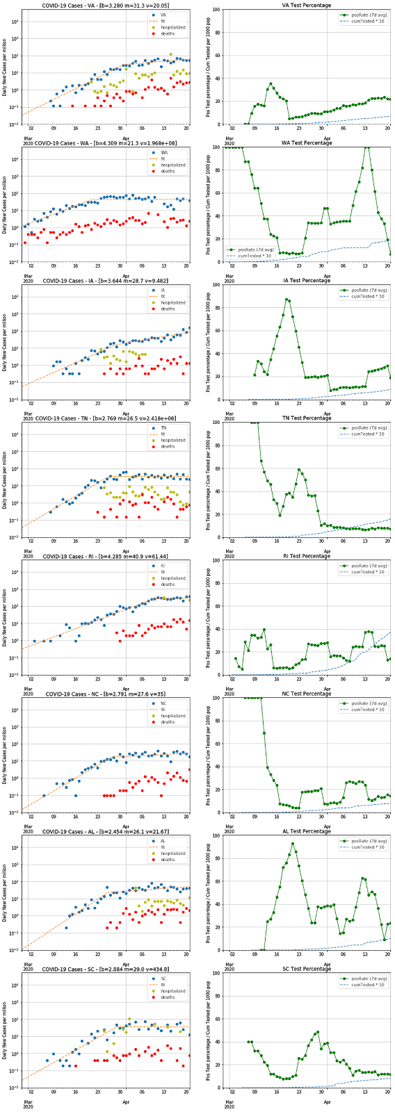
Second, I thought it was important to look at the fraction of positive test results, based on recent discussion in articles like this one in The Atlantic. The thesis there is that the COVID-19 case rate is flattening because our testing rate has plateaued and we may be misleading ourselves and missing an ongoing exponential growth in cases. Of course, this is why looking at the rate of COVID-19 hospitalizations or the COVID-19 deaths are going to be less biased and would avoid this type of ambiguity. However, as I noted in the last posting, both of these are problematic (the hospitalization data are not uniformly reported and the death rates lag infection by 1-2 weeks) and therefore the case-rate is still the best metric we have. I think, though, one can look at trends in the fraction of all tests yielding a positive result and control for the test plateau problem. If we are limiting our tests to only the sickest patients, one should see a rise in the positive fraction over time. Therefore, I decided to chart those for all states, along with the cumulative number of tests normalized by the state population (i.e. some approximation of the fraction of people tested). These charts show positive rates of about 10-20% in most places, with some outliers in the 30-40% range presumably indicating constrained test capacity (like NY, NJ, CT, MA, PA, DE, MI). There is a recent uptick in OH, which probably denotes something of interest, and MS is anomalously high and presumably means they are not reporting data to covidtracking.com in a way consistent with other states.
Third, it occurred to me that normalizing the case-rate (and the hospitalization-rate and death-rate) by state population is a good way to compare the states and calibrate how serious things are. Hence, a NY-scale outbreak is something like 500 new cases/day per million population, while FL is running at about 50 new cases/day per million. Along these lines, the recent outbreak in SD puts them into the 100 cases/day per million and a quiet place like AK is at 10 cases/day per million. Overall, this is a much better way to compare the state-by-state data and loses nothing in precision on the growth rates.
As always, please send me any comments or suggestions. All data are taken from covidtracking.com and my Jupyter notebook is here.


No comments:
Post a Comment