Sunday, January 16, 2022

3rd Generation of Net-Metering

My local paper, the San Jose Mercury News, published an editorial supporting the proposal from the California PUC to revise net metering for residential solar and impose new tariffs and fees.  I felt this missed the boat, not just by accepting the utilities cost figures at face value, but even more so by accepting without question the utility model of how to provide electric service to the public.  I tried to write a response as a letter-to-the-editor, but I couldn't manage to restrict the argument to the 150 word limit.  Here is that letter:


The problem with your Dec 22 editorial and with the surrounding discussions of various disputed cost analyses regarding the PUC proposal for the 3rd generation of solar net-metering rates is that it presupposes the current model of electric utilities and lacks vision as to the grid we might want to have in the future.

Sure, the cost per kW-hr might be cheaper with a concentrated solar plant in some remote location, but that necessitates reliance on expensive transmission lines that are prone to starting fires in our increasingly combustible conditions.  Wouldn't we be better off with solar generation and storage embedded within the locations of demand?  It doesn't take very much imagination to picture a world where every electric car has enough storage to power a house for 3 days and where solar roofs and parking structures are so widespread that the excess daytime power can continually keep all these batteries charged.  Rather than every individual house needing all of these resources, grid-sharing can optimize their use.  Power generation and storage would then neatly scale with population and demand.  In this model, there would be no need for large-scale power outages when equipment fails, as well as a reduced need for long-haul transmission lines.

We must not limit ourselves to the presumption of the current utility model when analyzing the benefits of rooftop solar.  Sure, we may need to tweak the time-of-use periods and rates to tune the incentives for new solar installations and for new storage batteries, but it doesn't make sense to halt the rapid growth of distributed solar just because the current utilities are losing money.  It is better to rework the structure of electric utilities so as to get the future electric grid we want than to give up on rooftop solar, which is one of the most rapidly growing sources of renewable energy in our current energy mix.

Tom Pavel 

San Jose


Sunday, April 4, 2021

DIY Muon Detectors

 As a former particle physicist and a current Raspberry Pi aficionado, I was instantly intrigued when I saw the Hackaday description of Marco Reps' CosmicPi build. This set me off on a bit of a quest to understand the state of DIY muon detectors.

Goals / Purpose

One important question to start with is "What would I want a muon detector for?" So far, I've come up with only about 3 answers. Nearly all of the DIY projects I've found seem to focus on the detector as a "teaching lab," i.e. a hands-on project for undergrads or high-schoolers to learn about building detectors and perhaps about the basics of cosmic rays. Here, the emphasis is just on detecting invisible particles (muons) and perhaps on measuring the change in muon flux as a function of declination angle or with altitude.

The second potential goal of such DIY detectors would be to crowd-source some kind of detector array for air showers. Initially, I understood such "citizen science" to be the main goal for the CosmicPi project. This is explicit in James Devine's TEDx talk, and I believe it is still a long-term hope for the CERN team, but they seem to have given up on this in the near term. The problem is that this would require a conveniently purchasable kit that could be assembled by hobbyists and sufficient uptake of these kits to find a reasonable density of detectors in any given geographic area in order to reconstruct cosmic air showers with some accuracy. Although I might well be interested to participate in such an effort, it doesn't seem likely that anyone would get useful physics measurements out of an organic, ragtag adoption of these devices.

That leaves the third potential goal for such devices, which would be muon tomography. There have been a number of research projects aiming at muon tomography, most famously with the effort to find undiscovered chambers in the Great Pyramid, but also with the MU-RAY project looking at Mt Vesuvius for magma chambers. It's not clear what hidden chambers one could find in your own house, but perhaps some interesting applications might come up. However, this does increase the complexity of the detector requirements. In particular, one would need decent angular resolution on the muon's direction, and this would either require a significant number of channels (i.e. multiple scintillators, scintillating fibers, or perhaps CCDs) or else a narrow aperture and a way to step across a useful field of view (which would then necessitate very long exposure times).

Survey of Prior Art

There are quite a lot of projects one can find in this general space, even though none of them truly reach the target of a DIY home-built detector.  My list doubtless leaves out many projects, but hopefully captures the most relevant ones.

CosmicPi

The initial reference I found was to the CosmicPi design, which came from a group at CERN. There is a recorded webinar from Dec 2020 that gives a good summary of the current state of their project. My understanding is that this is primarily now an outreach program for schools around CERN, with the CosmicPi team building some 1 or 2 dozen units (per year?). The designs have been open-sourced, allowing anyone else to build their own unit, in theory, but there are no comprehensive kits available for sale (and parts and PCBs would get more expensive in smaller lots). In the webinar, James Devine indicated the parts cost currently running about $375 (350 CHF), which is probably too high for the casual hobbyist.

CosmicWatch

It turns out that the CosmicWatch project at MIT is very similar to CosmicPI and also focused on student outreach, but perhaps coming from a slightly earlier generation of technology. It does not integrate a Raspberry Pi, but instead supports a serial port readout to an unspecified computer.  Also, the CosmicWatch detector holds a single 5cm x 5cm scintillator, rather than the pair of 10cm x 5cm scintillators in the CosmicPI.  Hence, one would need 2 of the $100 CosmicWatch units to do a similar coincidence trigger as on the CosmicPi design.  Part of the difference in expense could also be from the blue-to-green wavelength-shifting fiber (WSF) in the CosmicPi design versus the straight blue design in CosmicWatch.  It's unclear how big a difference in efficiency the WSF makes.  I think the main concern is to use WSF with larger scintillators where the blue light has a short absorption length  compared to the size of the scintillator.

OpenPhysicsLabs.org Muon Telescope

This description appears to be an independent effort very similar to the CosmicWatch effort (the paddles here are 5.7 cm squares vs 5 cm squares in CosmicWatch). There is some hint at using this for tomography, but it seems more geared towards students with, for example, a measurement of muon flux as a function of declination angle (and also the discussion about East-West asymmetry, which is a pretty interesting subtlety).

Muon Telescope at GSU

The project website seems unfinished, but there are some additional details on the github site. The concept uses 2 (or more?) paddles of 14.5 cm x 14.5 cm scintillator with a loop of WSF milled into the paddle to gather light into a silicon photomultiplier (SiPM) detector mounted on the corner of the paddle. It's unclear if this is aimed at a low-cost DIY project, since the machining and assembly seems fairly involved. It's also unclear how useful a resolution one would get from 14.5 cm paddles separated by 1 m or so.

MU-RAY project at Mt Vesuvius

This is not a DIY project (and not at all cheap!), but it demonstrates what is needed for useful muon tomography. The detectors are 1 m2 of triangle extrusions of plastic scintillator with wavelength-shifting fibers running down the centers. There are a total of 128 channels in each of 3 planes. A lot of good details are available in this talk.

MITO

MITO has a clever design where position info is extracted from a single scintillator block via timing of 4 PMTs at each of the corners. This is an interesting technique that could perhaps be applied at a smaller scale for a DIY project to reduce parts cost while still getting decent angular resolution.

Comparison of Technologies

For tomography, the main figure of interest is the angular resolution on a muon track. For a 2-paddle detector, this is something like the width of an element a divided by the distance between the paddle planes b. Obviously, things get easier if there are multiple channels next to each other in each of the planes, giving a wider aperture of varying muon angles that can be observed. The smaller that a gets, the closer the other detector plane can be and still give the same resolution a / b. However, the muon flux also decreases as a decreases, so there would be a need to increase the exposure time correspondingly as one shrinks a. One advantage of a cheap DIY muon detector, though, is that it can easily be run for very long exposure times.

An alternative to multiple scintillator blocks would be to use scintillating fibers. These are often embedded into scintillator blocks (such as the triangle extrusions of the MU-RAY detector), but they could also be used just as ribbons of multiple fibers. The downside, however, is that each fiber would need its own SiPM, so there is likely a significant cost with even 16 or 32 fibers.

An affordable alternative might be to use CCD camera chips with a light-proof cover over the lens. This provides a very large number of pixels with a very small a. However, the alignment of 2 or 3 camera planes with sufficient accuracy to reconstruct muon trajectories would likely be a significant technical challenge. Perhaps the alignment could be determined empirically with enough "calibration" tracks through (at least) 3 planes/CCD chips.

There have been a number of efforts to use cell-phone cameras as crowd-sourced muon detectors, so I  presume the technology is roughly viable as a muon detector (and it clearly has a cost advantage over scintillator and SiPMs).  I am currently experimenting with the Raspberry Pi camera to see how well this works in practice.  One big concern is the size of the camera being 100x smaller than the typical scintillator paddle (5x5 mm vs. 5x5 cm), requiring correspondingly longer exposure times.

  • DECO paper about cell-phone camera CCDs.  Also, sensorcast.org group.  Android-only app at present.
  • CRAYFIS project - another cell-phone effort.  Also a paper that analyzes the number of phones needed to make a decent air-shower collector.
  • Cosmic Ray App - similar app, but iOS only.

Tuesday, April 21, 2020

COVID-19: Where are the Case-Rates Declining?

I wasn't expecting to keep doing updates to these charts, but a few things came together in the last few days and made it worth another revision. 

First, there is all the recent talk about relaxing shutdown orders.  Anyone can see from the data that this is still premature.  Very few states have any signs of a decline in the rate of new cases, while even the Trump framework calls for at least 14 days of decline.  My scan of the data shows that NY and LA are the only states with any arguable decline (apart from the more sparsely populated ones with too much statistical noise to say definitively, like VT, ID, MT, WY, AK).  The NY data could be consistent with up to a week of declining cases, but this is relatively moot since NY can't really relax its shutdown until they see declines in NJ, CT, and other neighboring states (and CT is still growing at a doubling time of some 22 days currently).  The LA data are harder to interpret, with something of a peak around the beginning of Apr.  However, that peak could also be fluctuations and the data could well be consistent with a flat rate for the past week.  Earlier on, WA was looking consistent with a decline, but the case rate went up on Apr 17 and has stayed flat there since then.  Similarly, MI was showing some hints of decline, but today's point has gone back up and made a flat-rate the most likely hypothesis.  There are no signs of declines in FL, GA, TX, VA, or MN, some of which are still going up.

Second, I thought it was important to look at the fraction of positive test results, based on recent discussion in articles like this one in The Atlantic.  The thesis there is that the COVID-19 case rate is flattening because our testing rate has plateaued and we may be misleading ourselves and missing an ongoing exponential growth in cases.  Of course, this is why looking at the rate of COVID-19 hospitalizations or the COVID-19 deaths are going to be less biased and would avoid this type of ambiguity.  However, as I noted in the last posting, both of these are problematic (the hospitalization data are not uniformly reported and the death rates lag infection by 1-2 weeks) and therefore the case-rate is still the best metric we have.  I think, though, one can look at trends in the fraction of all tests yielding a positive result and control for the test plateau problem.  If we are limiting our tests to only the sickest patients, one should see a rise in the positive fraction over time.  Therefore, I decided to chart those for all states, along with the cumulative number of tests normalized by the state population (i.e. some approximation of the fraction of people tested).  These charts show positive rates of about 10-20% in most places, with some outliers in the 30-40% range presumably indicating constrained test capacity (like NY, NJ, CT, MA, PA, DE, MI).  There is a recent uptick in OH, which probably denotes something of interest, and MS is anomalously high and presumably means they are not reporting data to covidtracking.com in a way consistent with other states.

Third, it occurred to me that normalizing the case-rate (and the hospitalization-rate and death-rate) by state population is a good way to compare the states and calibrate how serious things are.  Hence, a NY-scale outbreak is something like 500 new cases/day per million population, while FL is running at about 50 new cases/day per million.  Along these lines, the recent outbreak in SD puts them into the 100 cases/day per million and a quiet place like AK is at 10 cases/day per million.  Overall, this is a much better way to compare the state-by-state data and loses nothing in precision on the growth rates.

As always, please send me any comments or suggestions.  All data are taken from covidtracking.com and my Jupyter notebook is here.


Thursday, April 16, 2020

COVID-19: Update on Stay-at-Home Effectiveness

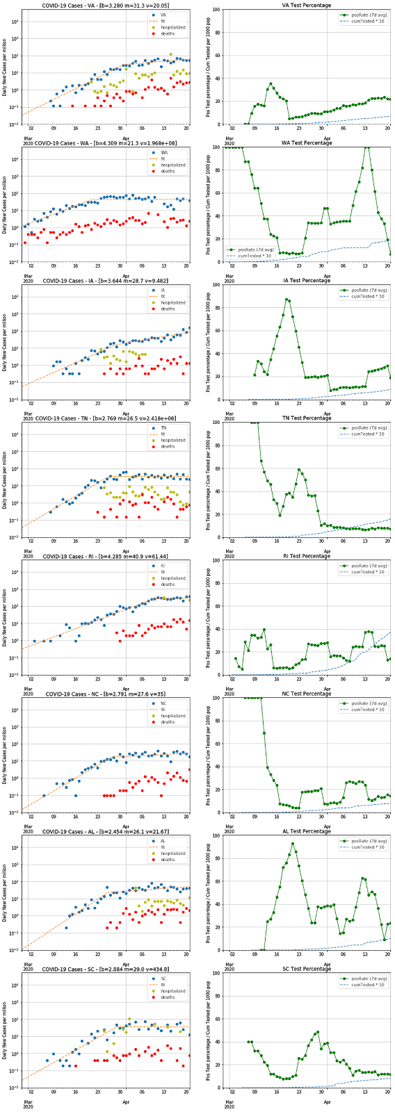
Two weeks after my previous post, there are now more data available and it's pretty clear that the stay-at-home measures result in a significant flattening of the exponential growth of infections. Even areas with less-restrictive measures (like Iowa or Arkansas) show some flattening of infection growth, which presumably means that every little bit of action people take helps to reduce the transmission of this virus.

I updated my charts with the latest data from the COVID Tracking Project and added fits to a 2-piece exponential with a bend in the middle at some date.  I thought it would be interesting to see what conclusions one could draw from these fits, but it's not clear that there are any really definitive trends.  Still, I thought it worth posting in case someone else might spot some insights in these data.

Methodology

As discussed in the previous post, fitting the positive case rate is not ideal, since there could well be trends caused by changes in the testing rates or testing schemes. There is much less ambiguity in the death-rate trends, but these lag by a week or two and they often have much more statistical noise (making for harder fits). Some states are reporting hospitalization rates and those could potentially be a more solid statistic to fit, but the reporting on this is still very spotty (as you can see). Therefore, I have stuck with fitting the case-rate, while plotting the other two numbers so that one can see how well they track one another. If you see the case-rate and death-rate diverge (not simply due to the time-lag), then you have good reason to suspect changes in the testing regime.

I have used a 4-parameter piece-wise function and fit minimizing the least-squares of the difference in logs of the data and fit function. Not all of the data yielded good fits, but I haven't noted this (although you can see the problematic ones in the charts). In some cases this is due to shapes not fitting the model, like states that haven't yet flattened out or ones like PA (and perhaps IL) that may have more of a 3-legged-exponential shape. The charts below label the inflection point as "m", the doubling-time of the earlier exponential as "b", and the doubling-time of the latter exponential as "v".

Observations

From these charts, one can see that the infection slope has generally been reduced significantly in most states sometime around the latter half of March. Many states now have slopes that are nearly flat (you should consider any fit with v > 20 as flat), but some are still growing at doubling-times of 7-14 days (GA, MD, AL, KY, MS, NM). Those still growing are a mix of states with strict stay-at-home policies and ones with laxer policies, so there must be other factors at play (e.g. population density and cultural behavior). In addition, there are states that haven't yet flattened but are still growing relatively slowly (DE, SD, PR, NE, and perhaps RI).

The only states showing a decline in case-rate are WA and LA. It makes sense that WA had the earliest infections, so they might be the first to see a decline. The LA curve has an unusual shape that perhaps indicates changes in how many tests are administered, but the death-rate does seem to have flattened out so perhaps the decline is real. There are hints of a decline in NY, PA, and IN, but too few data points that don't quite make a clear trend yet. The NY data looked like a decline until today's (Apr 15) data point showed up.

At present, COVID Tracking has no data for AS (American Somoa) and very little for MP, GU, VI. In addition, the statistics on the 8 smallest states (AK, ND, MT, HI, ME, WV, VT, WY) are probably too low for good confidence in any fit parameters. It might be helpful to chart all these data normalized by state population (to see the true prevalence of infection), but that would not help the statistical challenge of these small states.

Another interesting question is whether states in warmer climates have lower infection rates, which might have an implication for whether COVID-19 will show significant seasonality. In particular, the rapid flattening in FL (despite lax shelter-in-place policies) and the relatively quick downward trend in case-rate in LA in comparison to the mid-atlantic states suggested this hypothesis. However, I think the high growth rate in MS and the slower growth rates in many colder-climate states argue against this idea.

Fits by state


State b m v State Name
AK 3.726 24.7 1.056e+08 Alaska
AL 2.578 25.0 12.56 Alabama
AR 2.708 20.4 15.9 Arkansas
AS 0.000 0.0 0 American Somoa
AZ 2.674 26.0 61.4 Arizona
CA 3.428 28.0 69.16 California
CO 3.071 26.0 1623 Colorado
CT 2.089 26.8 19.17 Connecticut
DC 3.994 31.7 69.85 District of Columbia
DE 3.711 26.0 6.014 Delaware
FL 2.484 27.0 70.47 Florida
GA 2.485 23.9 13.74 Georgia
GU 11.780 24.0 89.11 Guam
HI 3.913 24.3 2.513e+07 Hawaii
IA 3.651 29.0 14.16 Iowa
ID 2.972 28.5 1.537e+08 Idaho
IL 1.879 21.5 10.04 Illinois
IN 2.486 29.2 2.502e+07 Indiana
KS 3.397 29.3 3.515e+05 Kansas
KY 3.660 28.0 10.54 Kentucky
LA 2.129 25.0 276.3 Louisiana
MA 3.066 28.5 15.03 Massachusetts
MD 2.870 28.0 10.25 Maryland
ME 2.963 20.3 26.41 Maine
MI 2.486 15.4 23.57 Michigan
MN 2.767 21.3 21.61 Minnesota
MO 1.951 26.6 191.5 Missouri
MP 0.000 0.0 0 Northern Mariana Islands
MS 1.672 20.9 13.66 Mississippi
MT 3.954 26.0 123.9 Montana
NC 2.791 26.6 44.33 North Carolina
ND 2.923 19.6 15.91 North Dakota
NE 9.018 15.0 5.8 Nebraska
NH 4.239 31.0 942.3 New Hampshire
NJ 1.881 25.5 43.08 New Jersey
NM 4.514 29.9 12.6 New Mexico
NV 3.081 27.5 2.2e+07 Nevada
NY 1.963 22.6 34.56 New York
OH 2.240 24.8 29.2 Ohio
OK 2.615 27.6 80.67 Oklahoma
OR 4.097 26.0 528.7 Oregon
PA 2.403 28.7 26.71 Pennsylvania
PR 9.094 72.2 10.13 Puerto Rico
RI 4.086 30.0 5.703 Rhode Island
SC 2.875 28.2 5.332e+07 South Carolina
SD 23.811 16.0 4.543 South Dakota
TN 2.769 25.7 1032 Tennessee
TX 2.831 31.2 65.69 Texas
UT 2.454 23.4 87.3 Utah
VA 3.280 30.3 20.3 Virginia
VI 2.627 20.0 4761 Virgin Islands
VT 3.090 24.0 2470 Vermont
WA 4.443 21.3 1.646e+08 Washington
WI 1.654 18.7 21.41 Wisconsin
WV 2.180 27.1 36.02 West Virginia
WY 5.308 31.0 110.3 Wyoming


Notes

As before, my Jupyter notebook file for this analysis is available for anyone who might be interested. Please send me comments and suggestions that occur to you.

Tuesday, March 31, 2020

COVID-19: How Well Are the Stay-at-Home Measures Working?

Like everyone else in the world, I've been wondering about how well the various stay-at-home orders and shutdowns are working to slow the spread of the epidemic. My background as a former particle physicist qualifies me as a "data nerd" and therefore I set about looking for charts on the spread of the virus. When I started, there were a few places that collected the right data, but no plots on a log-scale comparing the various countries and states, from which one could try to draw inferences. Eventually, the John Burn-Murdoch chart from FT came out, but even that wasn't quite what I wanted (e.g. cumulative cases vs new cases/day). So, I dusted off my Python Pandas coding and tried to answer various questions that came to mind.

Do the shutdowns work? 

 Looking at the reported cases in Italy, it's clear that the growth of new cases changed dramatically after the shutdown was put into place. One might expect it to take some 6 days from the start of the shutdown measures (since that is the reported average time from infection to contagiousness), but it might actually be quicker. I suspect this is because people start changing behavior even before the official stay-at-home orders are enacted.  It also doesn't help that the numbers went AWOL for a few days right around the knee of the curve (when things started getting really desperate in Italian hospitals).

[Data from JHU CSSE] 
There is, of course, a valid concern that the number of reported cases depends strongly on how much testing is being done, and that changes in the case rate could be due to changes in testing parameters. For this reason, I think that looking at the rate of hospitalized cases or the number of deaths are potentially more reliable indicators. However, the hospitalized rate is harder to find and the death rate is at far lower numbers (and therefore statistical precision). In reviewing all this data so far, it seems that the reported case rate is actually a surprisingly good proxy. I suppose it's just an example of how exponentials wash out all secondary terms and corrections.

 A further example can be seen in the New York state data. The good news here is that the shutdown measures did have a similar, rapid effect in the the growth rate. It has not leveled off yet and is still growing, but seems to be close to an inflection. Of course, that is the reported case rate, and the issues with hospital capacity and the peak in the death rate are still in the future.

[Data from COVID Tracking Project


How are things in California? 

My original interest was to see how things are going in my own local area. Here, the data do not show any real signs of a change in slope (yet). They do, however, show a slope that is slightly lower than the other hot spots (i.e. a doubling time of 3.6 days vs 2-2.5 days).

[Data from COVID Tracking Project

Even more locally, I've been recording the data from Santa Clara county (which was the original hot spot in California). At this smaller volume of cases, the statistical variation starts to make conclusions harder to draw, but my least-squares fit shows a doubling time of 5.2 days. The only explanation I can think of is that the San Francisco Bay area advised people to telecommute and avoid crowds long before the shelter-in-place order on Mar 17 and perhaps our curve began flattening early on. It does not, however, appear to be reaching a peak and inflecting, so I expect we still have a long period of shutdown ahead of us. 

[Data from SCC DPH]


Replicating this for other localities 

 I have looked at a few other states and countries, but I don't have a good way to visualize such a broad collection of data. If anyone is interested, I'm attaching my Jupyter notebook file, which should be easy to modify if you are familiar with the tools. Feel free to send me any suggestions, or especially to take what I've done and run with it in other directions.

Sunday, January 2, 2011

HeliBars on a Triumph Daytona 675

Based on a suggestion from Lee Parks when I took his TCARC class last fall, I decided to replace my Triumph clip-ons with the TracStar ones from HeliBars.  The instructions that came with the bars were quite thorough and comprehensible, but the pictures included were a little lacking.  Also, I think many folks are interested in seeing the difference between stock and aftermarket clip-ons, in order to decide how valuable this upgrade is.  So, I decided to try to document my HeliBar upgrade...


Comparison

BeforeAfter


Installation

The HeliBar instructions tell you to install the right clip-on first.  I switched it around and did the left first because I thought it would be simpler.  It turns out that the right has the brake reservoir to deal with, but the left requires removing and installing the grip (as opposed to the throttle assembly on the right), so it's really a wash as to which to start with.
  1. First, I recommend covering the tank with a cloth.  This would have saved me a nick or two in the process of dropping various tools and such.
  2. Remove the bar ends.  I didn't spring for the Craftsman tool suggested by the directions, but used a rag and a set of channel-locks.  This was not so easy to grip the funny angle on the bar end, and I ended up nicking one of the ends.  My advice is just to be very careful here.
  3. Remove the brake reservoir bracket.  No special challenge here.
  4. Remove the top triple.  I bought myself a 1.5-in socket, as there's no good way to get the torque right without it.
  5. Loosen the clutch mounting, loosen the left clip-on, and remove it.  I found the screws for the turn-signal switch to be easier to remove after flipping the clip-on over.
  6. Use some rubbing alcohol as a lubricant (and a small screwdriver to break the seal) and twist off the rubber grip.  Here you can also see the comparison between the 2 clip-ons.  The differences are fairly subtle, although the construction is noticeably different (e.g. solid vs hollow aluminum bar).
  7. Slip the new clip-on onto the fork tube and position it roughly in place.  Leave everything loose and don't worry about exactly where it goes.  Mount the clutch lever roughly in place (leave it loose), and then mount the turn-signal switch.  Note the hole drilled in the clip-on to fix the position of the turn-signal switch. (This picture is from the right-hand side, but both have similar positioning holes.)
  8. At this point, I  test-fitted the top triple back on and compared the new/left vs old/right bars.  The difference is most noticeable in this view.
  9. Now it's onto the right clip-on.  Things are mostly the same as the left.  You need to remove the original bracket for the brake reservoir (there's a replacement provided in the kit), but keep the original bolt and nut.  Loosening the brake lever was easy enough, as was loosening the switch unit; however, the screws on the throttle mounting gave me a lot of grief.  They are very easy to strip (see picture: don't do this at home...).  I ended up getting them out with an impact driver and replacing them with some hex-head M5 bolts from the hardware store.
  10. Again, here is the comparison of new and old parts.  The most obvious difference is in the brake reservoir bracket and how it attaches.

  11. Slide on the new clip-on and mount all of the original pieces again (throttle sleeve, switch unit, brake lever).  The only thing tricky here is remembering all of the cable and hose routing.  I found the throttle cables go in between the bleeder screw and the brake lever.
  12. Replace the top triple.  I found this a bit tricky to get on and lowered into the right position.  Pay attention to how it sat before you removed it (i.e. a few mm of fork tube were showing).  The instructions say to rock the bike off its front wheel to extend the suspension.  I did this a bit, but what I found most effective were a few taps from a rubber mallet to seat the triple.  Also, be careful to get the left and right fork tubes even.  That took a few more taps.  When you're happy that the triple is in the right place, hand-tighten the big 38mm nut to hold things in place.
  13. The key to placing the bars are the 2 5mm bolts that hold clip-on to the top triple.  They go as indicated in this view.  Start the bolt and tighten it down most of the way, but apply the forward pressure on the clip-on before tightening fully (as described in the instructions).  Then tighten down the pinch bolts on the clip-on.
  14. On the right-hand side, there's the extra step of installing the brake reservoir.  Note that the plastic of the reservoir has a stud that fits into the extra hole of the new bracket.  This locates it firmly at one joint, and you use the joint to the clip-on to adjust the level of the reservoir.  It's not possible to get the fluid exactly level, but you just want to get it reasonably close.
  15. When you put the bar ends back on, remember to use the extra washers provided in the HeliBar kit (and make sure they sit cleanly in the bar ends.

Monday, July 19, 2010

Interior Reupholstery

So, my plan was to start with the upholstery, figuring that would be an easy way to get back into things.  In the end, it turns out that upholstery work is fairly time-consuming.  Not so much the actual re-assembly of the seats, but getting all the materials together and getting the seat frames cleaned up of rust.  Details to follow.

Here are some useful links to articles on how to do upholstery:
I also had a paper copy of a similar article from mid-90s and a Mustang restoration book.  Each sources has its strengths and weaknesses.  None were quite as thorough as I'd wanted to see.